Discover the freshly updated eXo UX Guidelines: a new dark theme and tons of updates
Since eXo UX Guidelines was originally published, it has become a useful reference for anyone wanting to test or build an app in the style of eXo Platform. The guideline has been updated with all the changes for eXo Platform 4. Today, we are happy to announce an updated version of eXo UX Guidelines including the dark theme that was presented a few weeks ago along with the skin customization feature.

Thanks to the eXo skin customization feature, it is possible to build a skin add-on with any theme style. A set of dedicated variables can be customized to reconfigure all our main colors and backgrounds. This feature makes it easy to personalize the platform overall in a few steps. eXo UX Guidelines with the dark theme option is a real illustration for what we can customize with eXo Skin.
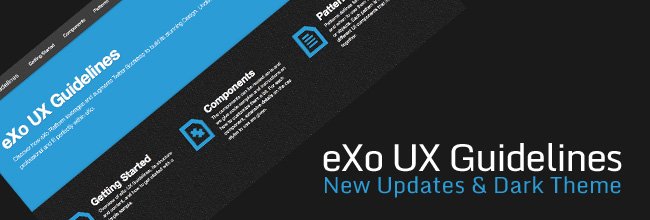
In eXo UX Guidelines, there are two options, Default Theme and Dark Theme, which are located at the top right of the site. To change the theme, simply click on your theme options and the site style will be changed correspondingly. With the dark theme option, all UI components and patterns are displayed in a dark style following the variable and icon changes.
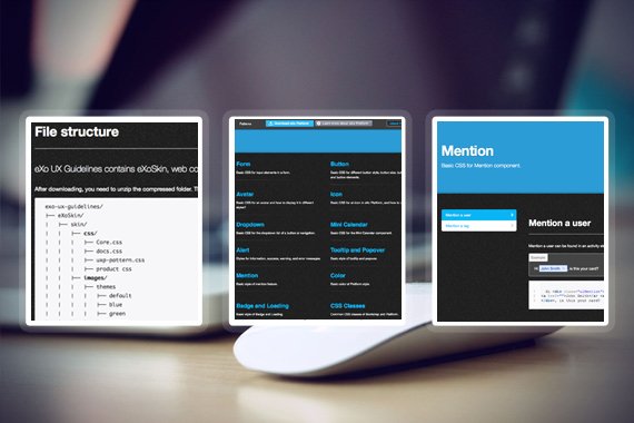
The new version of eXo UX Guidelines has been updated with a new file structure that completely matches the eXo Skin file structure. It is easier to maintain and update. There is a set of alternative icons and image collections including in red, green, blue, pink and orange, which are available for advanced customization.
See here how eXo UX Guidelines looks with the dark theme. Discover it now and do not hesitate to share your feedback.
Join the eXo tribe by registering for the community and get updates, tutorials, support, and access to the Platform and add-on downloads!
Make the most out of eXo Platform 4
Register to the next weekly live demo session and get a complete overview of what you can do with eXo Platform 4. Reserve your seat now!


