- Fares Laroui
- September 16, 2020
A closer look at UX and UI changes for eXo Platform 6
Earlier this month, we announced the general availability of our latest major version exo Platform 6. With this new release, we have worked on enriching the platform’s main capabilities by introducing a host of new features, such as news and the applications center, to address multiple use cases ranging from internal communications and instant connectivity to productivity and knowledge sharing.
To ensure these new features blend in perfectly with the platform, our teams of product specialists, designers and developers pitched various ideas to revamp the user experience and redesign the entire skin of the platform. Our numerous brainstorming sessions have resulted in a new UX and UI that we hope will provide our users with an optimal user experience as well as a visually appealing and engaging design.

Content
In this blog post we will take a closer look at the UX and UI changes we have implemented within eXo Platform 6.
1. The flat design is here to stay!
A flat design is a minimalist, two-dimensional style of design that emphasises readability, simplicity and efficient use of space. The design is also renowned for its colorfulness, with the use of bright and contrasting colours acting as visual cues on how to interact with various elements such as buttons, illustrations, and so on.
Flat and almost flat design styles are often considered as a contrast to skeuomorphic-type designs – a style which showcases real-life elements in three dimensions that users know how to interact with. Think of the early designs of smartphones and operating systems and the logo design of popular apps such as YouTube and Instagram, which slowly moved from a skeuomorphic style to more colorful and simple designs in recent years.
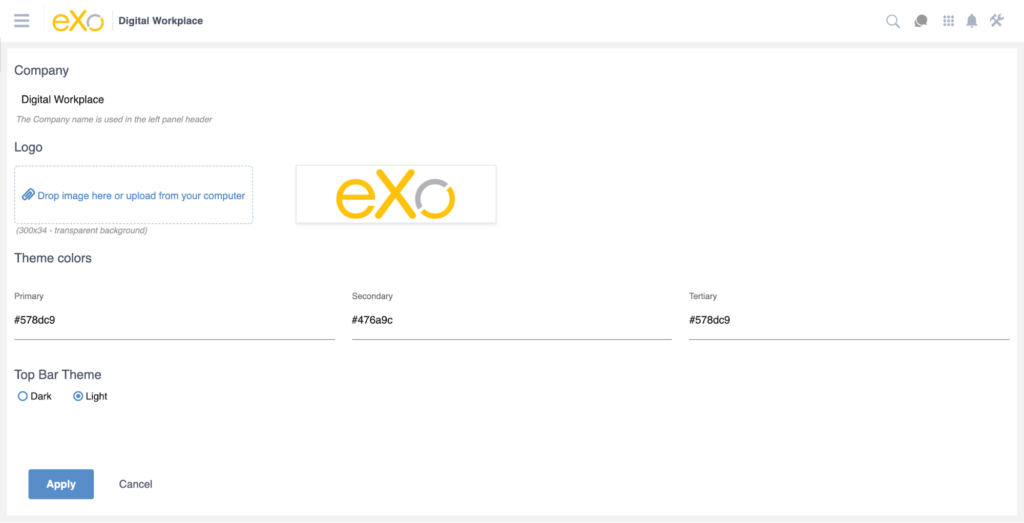
Similar to the eXo Platform 5 series, we have chosen to deploy a flat design with a number of slight improvements. First, the colour of the top and left navigation menus have been changed from our trademark blue to a more neutral white by default. Additionally, you can easily brand your eXo Platform instance by changing your company logo design and the color of the top navigation bar as well as buttons, titles, etc., as shown in the screenshot below.
2. A single access point to your digital workplace
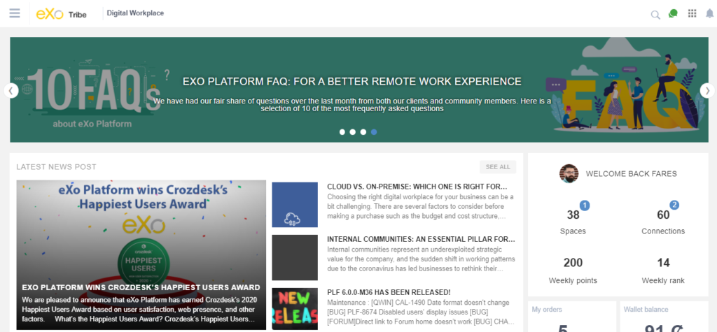
The key to guaranteeing high adoption rates and ensuring employees use their digital workplace solution to its full capacity is to make information from various sources readily available and easily accessible. This is why, in eXo Platform 6, we have introduced a newly designed home page.
Upon logging in to the platform, you will land on a new homepage by default. The homepage acts as a gateway to your digital workplace, containing a variety of content blocks for applications, shared articles, tasks, documents and more. This way, you can stay up to date with the latest activities and quickly locate what you are looking for. The social activity stream, which used to make up the homepage by default in previous versions, has been moved to its own dedicated “Stream” page, which you can access from the left navigation menu. Additionally, it is now possible to change your default landing page from the site’s homepage to another page (such as the stream page or the homepage of a space).
3. Easy navigation and efficient use of space
In eXo Platform 6, we have focused on facilitating navigation within the platform, limiting the learning curve for new users and optimising the use of screen space with drawers, sidebars and hamburger menus. For example, while scrolling down the activity stream or the homepage, only relevant information is on full display, allowing for flexibility and easy navigation between different sections of the page and limiting distractions. Other secondary elements of the digital workplace, such as the chat application, app launcher, search bar, notifications and the left navigation menu, are hidden under simple buttons or a hamburger menu when they are not needed. Once accessed, a drawer will appear in a separate layer, acting as a quick access to the selected element.

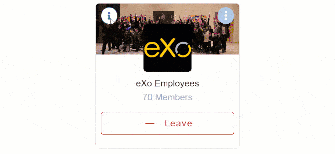
4. Combines beautiful design and usability with flipping cards
Some UX changes have been brought to both profile and spaces with the introduction of flipping cards. Flipping cards are a convenient way to present content and elements without using additional screen space. For example, a typical space card includes the name of the space and the member count along with the option to join/leave, open the group chat and display more information. The latter will be displayed at the back of the card as a brief description along with the managers of the space.
The same logic applies to profiles. The front of a profile card contains the name, the position within the company and the option to connect or disconnect as well as a drop-down menu with further actions such as sending a kudos, starting a conversation, and so on. The back of the card includes a brief description along with the number of connections and spaces.
5. Encourages and facilitates knowledge sharing via a rich text editor
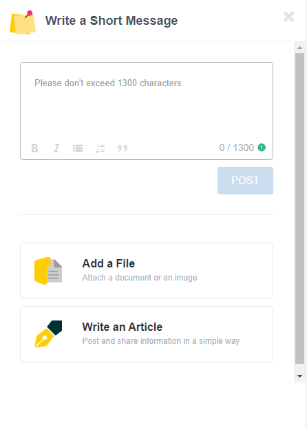
A key indicator on whether a digital workplace is fully embraced by users is how often they contribute and share content. One way to encourage and facilitate this process is to provide users with a rich text editor that’s both easy to use and easy to find.
For eXo Platform 6, the old activity composer has been replaced with a modern, extensible and user-friendly one. To access the activity composer, click on “Post in space”. A drawer will appear on the right-hand side of the screen incorporating a variety of actions, such as the option to upload files, connect to internal or external drives, share links and insert images and videos. Additionally, users with editing rights can share news directly through the activity composer by clicking on “Write an article”.
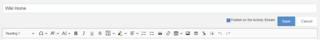
We have also adopted the same approach with wikis by upgrading the wiki editor to the latest version of CKEditor (CKEditor 5). The UI and UX were replaced by a simpler, more responsive WYSIWYG design that blends in well with the platform’s new overall design. Make sure to read this blog post for a closer look at the wiki editor.
If you would like to know more about eXo Platform 6, we invite you to read this blog post and our dedicated sneak peek series.
To see eXo Platform 6 in action, make sure to save your spot for our upcoming webinar in which Marwen Mema, our solutions expert, will take you on a guided tour of the platform.
As always, we welcome your questions and recommendations here. On behalf of the eXo team, we thank you for your trust and we hope you enjoy this new release.
eXo Platform 6 Free Datasheet
Download the eXo Platform 6 Datasheet and
discover all the features and benefits
discover all the features and benefits
- Tags: eXo, Product News
5/5 - (1 vote)

I am a product marketing specialist at eXo. My role is to assist marketing and sales teams in their operations and present our digital workplace solution to the world. I mainly blog about the latest tech trends, digital transformation, internal communication and how to navigate through eXo Platform.
Related posts
- All
- eXo
- Digital workplace
- Employee engagement
- Open source
- Future of work
- Internal communication
- Collaboration
- News
- intranet
- workplace
- Knowledge management
- Employee experience
- Employee productivity
- onboarding
- Employee recognition
- Change management
- Cartoon
- Digital transformation
- Infographic
- Remote work
- Industry trends
- Product News
- Thought leadership
- Tips & Tricks
- Tutorial
- Uncategorized

Leave a Reply
( Your e-mail address will not be published)
Connexion
0 Comments
Commentaires en ligne
Afficher tous les commentaires