- Fares Laroui
- April 9, 2020
Efficient UI and UX buttons for a better digital workplace experience
There is nothing more frustrating for users than software that is not easy on the eye, does not fit their needs and only performs basic actions.
The failure to grasp an understanding of users’ needs can often lead to a poorly designed solution, which in turn results in low engagement and adoption rates and negatively affects productivity.
The main causes of such failures are the assumptions made by designers that they know what users want, individual decisions based on previous experiences that don’t necessarily apply to the project at hand and of course a lack of resources and skilled designers who can carry out the project. As a company, you can also outsource graphic design to experts.

Content
Just imagine opening your company intranet to find a poor visual layout, no dashboard connected to the main apps, an ineffective search engine and content that is hard to locate. It is safe to say that you would either spend a significant amount of your time learning how to use the platform or choose other tools like email to get the job done. This shows the importance of both UX and UI in making life easier for users and guaranteeing that the platform is used to its full capacity.
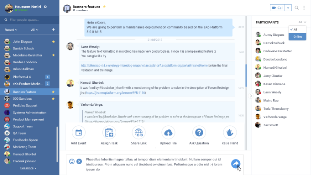
One of the most important elements that will allow users to interact with your platform is buttons. Although quite unnoticeable if implemented correctly, buttons are crucial for the success of any software as they are one of the first things users will interact with.
1. UX and UI design in a nutshell
In simple terms, UI design refers to user interface design, and it is basically the look and style of the solution and how users interact with various elements such as screens, buttons, banners etc. Think of UI as a bridge that connects the software provider or a company with its users by facilitating commands and navigation and providing visual feedback with each action taken. In order to create an intuitive and user-friendly UI design, many companies utilize a product design sprint to collaboratively ideate, prototype, and test different interface elements such as screens, buttons, and banners, ensuring a seamless interaction between users and the solution.
On the other hand, UX refers to how users engage with the solution, whether it is useful for them and what the takeaways are of the experience. There are a variety of tools and techniques used by UX teams to optimise the user experience such as analysing usage data, surveys to collect feedback from current and potential users, creating user personas and scenarios etc.
There is often confusion between UX and UI. UX and UI are interdependent but not interchangeable. Both elements are crucial to the success of a product. A failure to do one or the other can have a significant impact on the usage and adoption of a solution. When it comes to buttons, it is equally important to design buttons that are visually appealing and grasp the attention of users but also to design ones that function correctly and help get the job done.
FREE WHITE PAPER
Types of Digital workplace solutions
The modern workplace has evolved significantly in recent years, with advancements in technology, the growing number of tools …
2. Some best practices for button design
We can distinguish several types of buttons that you may have already come across using popular consumer apps like Google or social media platforms like Facebook and Twitter. Button types range from simple text and radio buttons to more complex and visual buttons like ghost, raised, floating actions and dropdown buttons. In order to choose the right type for your platform and develop an effective user experience, there are several key practices that should be followed.
Understand users’ needs
To personalise your digital workplace and provide users with an optimal user experience, first you have to understand the users’ needs and measure areas of improvement. Feedback can be gathered by interviews or usage data collected in real-time from the platform like heat maps, event tracking etc. You can take the survey a step further by including open-ended questions to let your employees express their opinion freely.
This will constitute the basis of your project as the feedback can give a clear indication on the types of buttons preferred by users, their placement, size and more importantly their number.
For example, data from a heat map can help you understand how users navigate through the homepage, the most clicked buttons etc. Through A/B testing you can compare two different versions of a homepage with different layouts, button sizes and placement and see which one performs better.
Avoid assumptions
Real-time feedback
Provide cues on how buttons can be used
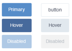
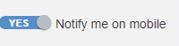
It may seem obvious but designing a button that is self-explanatory and shows exactly how it can be used is crucial. This concept is known as ‘affordance’. The affordances of an object are the different characteristics that might give an indication on its use. For example, a door without a door knob can only be pushed. The same applies to buttons as they can be designed to either be turned, clicked etc., but how do we know they are clickable?
A raised button with the right outline like “Download’ is a great example of affordance as it distinguishes the button and shows how it can be used. Another example may be setting notifications with a toggle button with two choices such as ‘on/off’ or ‘enable/disable’.
Make sure buttons are visible and easy to reach
As the saying goes “the hands can’t hit what the eyes can’t see.” More like click in this case but you get the point. The only way to click a button is by actually realising there is one in the first place. This is why it is important to place buttons in areas where they are most likely to be clicked with the appropriate design and a clear outline. This will help users navigate the platform with ease and reduce the learning curve.
For example, important buttons should be placed in the top bar since users often follow the ‘F Pattern’ when reading a web page. So rather than displaying buttons such as app logos throughout the entire page, consider a dropdown button for a fast access app launcher on the top bar.
F-shaped pattern
Buttons should be consistent across the digital workplace
Keep in mind UX and UI differences between mobile and desktop
When designing or choosing the buttons to add to your digital workplace or website, it is important to consider the different user experiences on both mobile and desktop. However, achieving a consistent design on both platforms is a bit tricky as each one has its own characteristics and UX/UI principles.
For example, the mouse is the primary way to navigate and click buttons on a desktop without a touchscreen, whereas mobile devices take input directly from users through touchscreens. As a result, buttons should be developed using different approaches. On the desktop, the focus should be on precision and visual feedback whenever the user performs an action (hover, click etc). However, on the mobile, precision is low since users don’t have the same finger size and feedback is provided in a different way like haptic feedback following actions like swiping for example.
Another notable difference is in terms of navigation and placement. Since mobile devices have smaller screens than desktops, content is organised with less flexibility and room for UI elements and hence navigation patterns are different. Users can navigate with less freedom following more predictable patterns (vertically by scrolling, horizontally by swiping) which plays a role in navigation and button placement as buttons must be visible and easy to identify.
Furthermore, less real estate on a mobile screen means that for buttons to be a usable size they must occupy a greater proportion of the mobile screen than they would on a desktop. This pushes designers to rely on icons more than text buttons, such as the hamburger menu, to group options and display more important buttons on the main screen. Other designs that are popular in mobile include tab bars and floating action buttons. On the other hand, there is more space on desktop hence the use of text buttons that don’t take up much space on the screen but still identifiable if placed correctly.
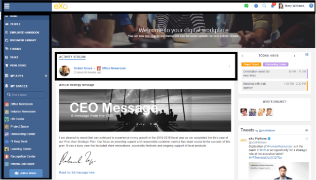
Desktop interface
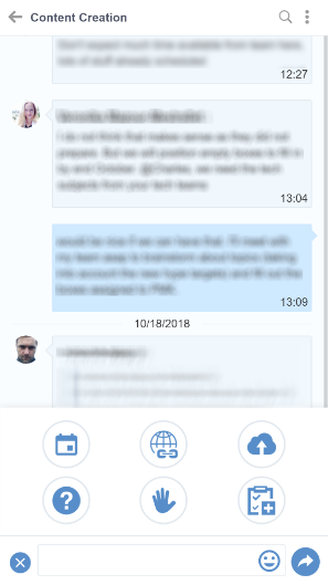
Mobile interface
Continuously test the buttons
The final step is to test the buttons and find bugs. Try to figure out whether the button works as expected, how it will behave if misused, whether it is placed properly and whether it can be hacked by simple HTML commands. This way you can quickly figure out and fix vulnerabilities.
UX and UI techniques are evolving with each passing year. They are a direct reflection of changes in our daily lives that push businesses to adapt and develop innovative solutions tailored to their users. The flexible nature of today’s software coupled with the growing demand for personalisation means that users can customise their solutions to give them a unique identity and control the user experience. Buttons are a crucial part of any solution’s success as they represent the link that enables users to communicate with the software and perform certain activities.
The types and best practices for button design mentioned in this blog post are a comprehensive list. If you would like to learn more about the topic of UX and the digital workplace I suggest you listen to the Digital Workplace Impact podcast titled “Real-world usability in the modern digital workplace” and subscribe to our newsletter for similar content.
engagement and performance
FAQs
You will find here Frequently Asked Questions about digital workplace with all the answers in one place.
What is a digital workplace?
- An evolution of the intranet
- A user centric digital experience
How to launch an effective Digital Workplace?
- Understand users’ needs
- Identify your digital workplace ambassadors
- Build the digital workplace brand
- Training and onboarding
- Plan the big day
What does digital workplace really mean?
How to be a good digital workplace manager?
- Analytical skills and approach
- Focus on employees
- Communication and strategic vision

Related posts
- All
- eXo
- Digital workplace
- Employee engagement
- Open source
- Future of work
- Internal communication
- Collaboration
- News
- intranet
- workplace
- Knowledge management
- Employee experience
- Employee productivity
- onboarding
- Employee recognition
- Change management
- Cartoon
- Digital transformation
- Infographic
- Remote work
- Industry trends
- Product News
- Thought leadership
- Tips & Tricks
- Tutorial
- Uncategorized


Leave a Reply
( Your e-mail address will not be published)