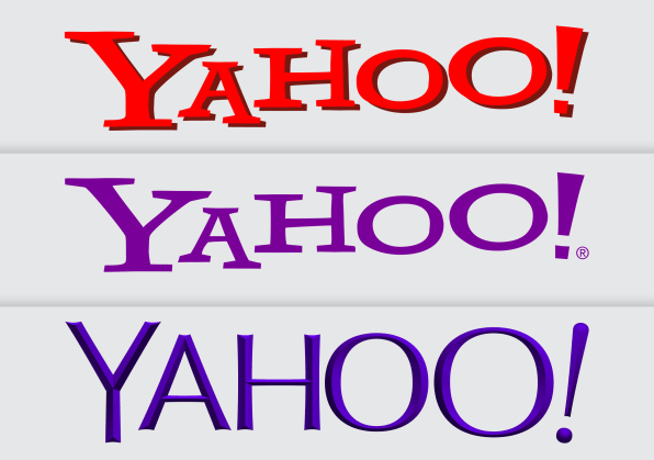
Yahoo, the first portal dedicated to news, weather, sports and everything else had an undeniable brand: it conveyed the idiosyncratic and optimistic promise of those early days of the Web, with a hand-drawn and reinforced logo that seemed to laugh like a child in his father’s old zoot suit, found buried in a closet.
Yahoo’s new logo marks the first redesign of the company since its major overhaul under the leadership of Marissa Mayer who launched “30 Logos in 30 Days“, where Yahoo displays a different logo on its website for a full month in 2013.
With the new logo, Yahoo also announced an updated version of its flagship Yahoo Mail application, which the company probably hopes customers have forgotten saw all 3 billion of its users hacked in 2013. The new Yahoo mail includes dedicated tabs for attachments, local shopping offers and one-click unsubscription, as well as a design with the new logo.
For the design team, the brand change process consisted in identifying the strongest characteristics of the old Yahoo brand to preserve. One of the first lessons learned was that the name “Yahoo” actually had a strong brand presence.
Pentagram has chosen a more lively font, Centra No. 2 extra bold, which gives the double-O of “Yahoo” a sympathetic anthropomorphic and borderline character.
Pentagram, which has done similar work for brands such as Slack, Expedia and Rolls Royce, says the new logo coincides (in large part) with the launch of Yahoo’s new Mail application. The agency started working on the logo last March with Yahoo’s creative team. “It probably took two months to get something that looks like the final logo,” Michael Bierut, partner and owner of Pentagram, told Ad Age. “We then spent the summer perfecting the software and ensuring that it was performing well on all of the company’s platforms.
Yahoo is trying to refresh itself to face reality because it is 2019 and the competitors are not only not disappearing, but their platforms are getting bigger and deeper. Yahoo is confronted with an existential moment and its answer is to plant a new flag.
Yahoo was once the main player in research, but today it is the third largest player in the sector. The company holds about 3% of the market, behind the No. 2 Bing (5%) and Google (88%), according to Statista, a company owned by Amazon.